
Coastal Decor: Copy What the Sea Does, Not What It Looks Like

Search "coastal decor" and you get the same room a hundred times: white sofa, striped pillow, a jar of shells, an anchor on the wall.
Copy that room and something strange happens — it reads as a gift shop, not a beach house. The rooms that actually feel coastal often have no shells in them at all.
Here's the difference. Real seaside houses look the way they do because the sea did things to them. The sun bleached the fabric. The sand forced washable slipcovers. The glare off the water demanded pale walls. Coastal style is a set of side effects — and when you copy the side effects, you get the feeling. When you copy pictures of the ocean, you get a theme.
This guide walks through the five things the coast does to a house and the decorating move each one created, so you can build the feeling in any apartment, any distance from the water.
Jump to a section
- Why every coastal room has the same five moves
- Start with light, the engine of the style
- The palette the sun already picked
- Fabric that expects a wet swimsuit
- Wood that looks weathered, not stained dark
- Let texture carry the beach
- The airy part is literal
- Blue is a dose, not a default
- The souvenir test
- Room by room: where each one starts
- Renting? Build the version that moves out with you
- FAQ
Why every coastal room has the same five moves

Strip away the product lists and every coastal room runs on five signatures: pale walls, a sun-faded palette, washable fabric, weathered wood, and rough natural texture. None of them started as a style choice. Each one is a response to something the seaside does:
- Glare off water and sky is doubled daylight, so beach houses went pale to soften it — dark walls next to that much light feel like a cave.
- Sun bleaches everything it touches, so the palette drifted toward sand, bone, driftwood, and blues that look washed, not saturated.
- Sand and salt water walk in on every towel and swimsuit, so the fabric that survived was cotton and linen you can pull off and wash.
- Weather grays out wood and dulls varnish, so the furniture that looks right is pale, matte, and a little rough.
- Wind means doors open, curtains move, and nothing precious sits on the windowsill — which is why coastal rooms keep floors clear and objects few.
That's the whole system. Every decision in this article is one of these five causes, translated for a home that's nowhere near a beach. Keep the causes in mind and you can judge any purchase in about three seconds.
Start with light, the engine of the style

A beach house gets light from two directions — the sky, and the water bouncing the sky back up. Your apartment gets one window and whatever the building across the street allows. So the first coastal move is not buying anything blue; it's getting your existing light to work harder.
Paint's light-reflectance value — LRV, the amount of light a color bounces back — is the tool for this. Sherwin-Williams puts it plainly: "Lighter tinted paints have higher light reflectance values than darker ones," and the value matters most in rooms that don't get much sun. A warm white or pale sand wall is recycling daylight every time it bounces; a navy accent wall is eating it.
If you want the full method — window direction, curtain choices, where a mirror earns its spot — we've written it as a complete light plan for a coastal living room. The short version: make the brightest surfaces the biggest ones (walls, curtains, sofa), and spend your dark colors on the smallest.
The palette the sun already picked

There's a reason no paint company sells a coastal collection full of primary colors. Strong light genuinely destroys saturated color — the Library of Congress tells people storing works on paper to allow "minimal exposure to all kinds of light; no exposure to direct or intense light", because fading is real, physical damage. A beach house is that experiment run for decades. What's left afterward is the coastal palette: sand, bone, fog, driftwood gray, and blue with the confidence washed out of it.
So when you pick colors, pick them pre-faded. Hold two blue pillows side by side and take the one that looks like it spent a summer in a window. If a color would look at home in a crayon box, it will fight every other coastal choice in the room. This one habit — buying the washed version of every color — does more for the style than any object with a fish on it.
Fabric that expects a wet swimsuit

The classic coastal slipcover sofa exists because beach-house furniture gets sat on by people who were just in the ocean. Washable white cotton wasn't a look; it was the only survivor. That origin gives you the rule for every textile in the room: could it go in the machine this weekend?
Cotton, linen, and cotton-linen blends pass. So do most woven throws and any cover that zips off. What fails is anything dry-clean-only, anything with a rubber backing, velvet, and most of what sells as "performance" fabric in dark colors. You don't need a white sofa — you need covers, and the habit of washing them. A rumpled, clean, just-washed texture is the coastal look; a stain-guarded formal sofa in beige is not, no matter what pillow you put on it.
This is also the cheapest full-room move available: duvet cover, curtains, two pillow covers, and a throw in washed cotton and linen will shift a room's whole character for less than one piece of furniture.
Wood that looks weathered, not stained dark
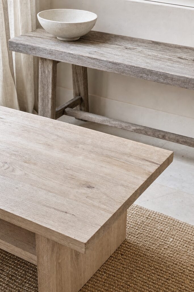
Leave a cedar fence alone outdoors and it slowly turns silver-gray. That surface — dry, matte, gray-brown — is what coastal furniture is imitating. It's why the style leans on pale oak, ash, rattan, bamboo, and teak that's allowed to dull, and why a glossy espresso-stained TV stand reads wrong in a coastal room even when everything around it is right.
You rarely need new furniture to fix this. Pick your one or two most visible wood surfaces — usually the coffee table and whatever the TV sits on — and make those the pale ones; secondhand pine and oak pieces are everywhere and cheap. A dark bed frame or bookshelf can stay if you calm it down with pale textiles around it. The eye averages a room's wood tones, so you're steering the average, not replacing the inventory.
Let texture carry the beach

Here's the trade at the heart of tasteful coastal rooms: rough natural texture does the job that souvenir objects are usually asked to do. A jute rug, one rattan chair, a rope-wrapped lamp, a raw linen curtain — each says "outdoors, weathered, natural" without depicting anything. Your eye gets the beach; your guests can't point at it.
Texture has a dose, though. One or two woven statements per room is the range. When the rug, chairs, mirror frame, pendant light, and baskets are all woven, the room stops reading coastal and starts reading like a store display of woven things. Pick the biggest opportunity — usually the rug — make it jute or sisal, then add exactly one more rough texture at eye level and stop.
The airy part is literal

"Light and airy" gets used as a vague compliment, but in a beach house the airy part is physical: windows open, air moves, curtains move with it. You can copy more of that than you'd think.
Hang curtains that weigh almost nothing — white sheers or open-weave linen — and mount the rod wider than the window frame so the fabric stacks against the wall, not over the glass. Then protect emptiness like it's an object you paid for. A coastal room needs visible floor around the furniture and at least one completely clear surface. If every table holds a vignette, no breeze could move through the room even in your imagination. When you're deciding between adding a sixth decorative object and leaving the surface bare, bare is the coastal choice.
Blue is a dose, not a default

The most common coastal mistake is arithmetic: people hear "beach" and make blue the biggest color in the room. But look at an actual beach — you stand on acres of sand and the water is the thing in the distance. The rooms that feel right keep the same ratio: sand, white, and driftwood do the square footage, and blue arrives in doses. Two pillows. One throw. A print. A vase.
The dose can flex by room. We've written up the exact sand-to-sea formula for a coastal bedroom, including the moodier navy version — the principle is the same everywhere: when blue wins the square-footage count, the room tips from coastal to nautical, and nautical is much harder to keep out of costume territory.
The souvenir test

You now have enough to run the test that sorts every coastal purchase. Pick up the object and ask: is this something the sea would do to a house, or a picture of the sea?
A washed-linen curtain passes — sun and salt would make that. A pale jute rug passes. A framed print that's mostly a field of hazy blue passes, barely. An anchor, a "BEACH" sign, a lighthouse lamp, a net on the wall: those are pictures of the sea. They don't make the room feel like a place; they announce a theme, and themes expire fast.
Shells are the hard case because they're genuinely from the beach. The problem is that a bowl of shells is the most-copied object in the entire style — it stopped reading as "found on a walk" and started reading as "aisle five." If shells matter to you personally, keep a few, in one spot, and let them be the only sea-referencing object in the room. Our coastal bathroom guide applies the same one-souvenir discipline room-wide, and it's the room where restraint is hardest.
Room by room: where each one starts

The five causes apply everywhere, but each room has a different first domino:
- Living room — light. The sofa and curtains are the biggest reflective surfaces you control; start with the light-first plan.
- Bedroom — the bed. It's most of the room's visible fabric, so the washed-cotton rule practically decorates the room for you; the bedroom formula is here.
- Bathroom — restraint. It's the smallest room and the one most likely to tip into theme; the keep-and-skip list is here.
- Kitchen — texture and openness. A jute runner, open shelves with white dishes, and one wooden board wall do it; skip the lobster towels entirely.
- Balcony or patio — the one place the "airy" part is free; our apartment patio guide covers the furniture that survives outside.
Start with one room and finish it. A half-coastal apartment where every room has one striped pillow reads as indecision; one fully resolved room reads as a point of view.
Renting? Build the version that moves out with you

Almost everything above is already renter-shaped, which is part of why this style suits apartments so well. The load-bearing moves are textiles, a rug, curtains, lamps, and secondhand pale wood — all of which come with you at move-out. If the walls are a color you'd never choose, you have two options that don't involve a roller: lighten every other big surface so the wall matters less, or use the deposit-safe wall tactics in our rental decorating hacks guide — the risk-sorted list is exactly the tool for the "can I actually do this in a lease?" question.
One honest budget note: because this style runs on natural fibers — linen, jute, rattan, oak — the cheap synthetic copy of each one photographs fine and disappoints in person. Buy fewer things, in real materials, secondhand where possible. A room with five true coastal objects and bare surfaces will beat a room with twenty approximations.
FAQ
What is coastal decor, in one sentence?
It's the style that copies what sun, sand, salt, and wind do to seaside houses — pale reflected light, faded color, washable fabric, weathered wood, rough texture — rather than displaying images of the ocean.
How is coastal different from nautical?
Nautical is a theme with props: navy-and-white, anchors, rope knots, ship imagery. Coastal is an atmosphere with almost no required objects. A useful check: nautical decor depicts boats and the sea; coastal decor looks like what the sea does to a room. The two mix badly, and blue-heavy rooms drift nautical fast.
Can a room with no blue at all still be coastal?
Yes — and some of the best ones are. Sand, white, driftwood gray, and pale wood with plenty of light reads unmistakably coastal. Blue is seasoning. If you love it, use it in doses; if you don't, skip it.
Does coastal decor work in a dark apartment?
It's actually one of the better styles for one, because it's engineered to maximize whatever light exists — high-LRV walls, sheer curtains, pale textiles all recycle daylight. Be realistic about the ceiling: a genuinely dark room becomes a brighter dark room, not a sunroom. The bulbs-and-mirrors half of the problem is covered in our living room light plan.
Is coastal decor going out of style?
The souvenir layer dates fast — signs, anchors, shell arrangements have clear expiration dates. The base layer doesn't: pale rooms, washed natural fabric, and weathered wood have stayed current for decades because they're materials, not references. Build the base layer and you can retire the references without redecorating.


