Coastal Bedroom Decor: Mostly Sand, a Little Sea

Coastal bedroom decor comes down to a proportion, not a theme: mostly sand, a little sea. Keep most of the room in warm sandy neutrals, add blue in a few doses you can actually count, and the bedroom reads breezy and calm without a single seashell in sight.
Miss the proportion and the room fails in one of two directions. Too little sea and you get builder-beige with one lonely navy pillow; too much theme and you get a souvenir shop with a bed in it. This guide gives you the formula in order — sand, sea, texture, wood, light — then the restraint rule that separates coastal from beach-themed, plus two ways to shift the mood when the standard version feels too safe.
Jump to a section
- The coastal formula: mostly sand, a little sea
- Start with sand, not stark white
- Add the sea in doses, not gallons
- Let texture do the beach work
- Driftwood, not espresso: get the wood right
- Keep the light bare and bright
- The one-souvenir rule
- Moodier: the navy coastal bedroom
- Softer: the coastal-grandmother version
- Coastal in a rental bedroom, without repainting
- FAQ
The coastal formula: mostly sand, a little sea

Coastal is what a morning at the shore feels like — light, air, washed-out color — not a display of things from the gift shop. That is why the proportions matter more than any individual purchase. The room should be mostly sand: walls, bedding, rugs, and big furniture in warm whites and naturals. The sea shows up small: blue or green accents in countable doses. Wood stays pale, like driftwood. And the window works harder than any decor object in the room.
Read the four bands in the diagram as a shopping filter, not a checklist. Before anything comes home, ask which band it belongs to. If the answer is "none — it's just beachy," that's the item that tips the room into costume territory.
One thing this formula deliberately leaves out: beach objects. They come last, they are optional, and the limit is one. More on that rule later, because it deserves its own section.
Start with sand, not stark white

The coastal base is warm white — cream, ivory, oatmeal — never a cold, blue-tinged bright white. Sand is warm; that's the whole trick. A stark white room with blue accents reads crisp and a little corporate, like a hotel near a marina. The same blue against cream and oatmeal reads relaxed, and that difference is set before a single accent goes in.
Build the base in three moves. Walls in a warm white or light greige. Bedding mostly natural — ivory or oatmeal linen and cotton, layered rather than matched. A rug in a natural fiber tone, even if the fiber itself is soft wool.
The test of the base layer: with every blue item removed, the room should already look intentional and calm, like the photo above. If your room only works because of its accents, the base is carrying too little — most "my bedroom looks off" problems live here, not in the decor.
Add the sea in doses, not gallons

Three to four doses of blue is enough for a full-size bedroom: one throw, two pillows, one artwork. That is the entire sea layer in the photo above, and you can count it. Countable is the point — each dose stays a deliberate accent against the sand instead of merging into a "blue room."
Choose washed blues: chambray, faded denim, sea glass. These read like water and worn beach glass because they are grayed and softened, the way sun and salt fade real color. Bright royal or primary blue reads sporty, not coastal, no matter how little you use.
The doses also want a little vertical spread — one low on the bed, one at pillow height, one up on the wall — so the eye finds blue moving through the room rather than pooled in one spot. When you're tempted by a fifth blue item, swap one out instead of adding. The formula caps the sea; that cap is what keeps the room feeling airy in a year, after the accents have multiplied.
Coastal without blue

If blue isn't your color, green-gray does the same job. Sea glass and sea foam sit right next to water on the color wheel, and they may age better — a green-gray bedroom reads spa-calm rather than "blue room."
If you can paint, this is where a named color earns its keep: Sherwin-Williams Sea Salt (SW 6204) is a soft green-gray with a light reflectance value around 63 — light enough to keep a bedroom airy, with enough color to notice. Fair warning from the many rooms it's been used in: it shifts. In bright south light it leans green; in dim or north light it grays out. Sample a swatch on two walls and look at it morning and night before committing.
You can even skip the sea layer entirely and let texture carry the room — which is the next section, and the most underrated part of the whole look.
Let texture do the beach work
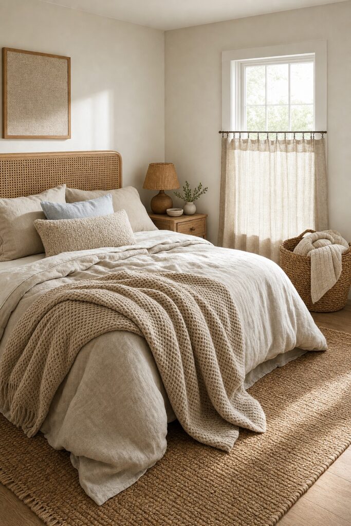
Texture is what actually signals "shore" — washed linen, waffle weave, jute, cane — and it works even in a room with almost no color. The photo above has barely one pale blue object in it, and it still reads coastal. Smooth, shiny fabrics do the opposite: a sateen comforter will quietly fight every natural fiber around it.
Two honest notes before you buy, both consistent across long-term reviews. Linen starts rough and wrinkles forever. It softens noticeably after each wash, and the rumple is part of the look — but if you want soft from night one, buy prewashed or stonewashed linen, or use a linen duvet over cotton sheets. And 100% jute is scratchy underfoot and sheds, especially when new; long-term reviewers consistently report fiber dust for the first weeks. In a barefoot room like a bedroom, a wool-jute blend or a washable cotton flat-weave gives the same sandy texture with less prickle.
Layer the textures inside one narrow color family — oatmeal, flax, ivory — and vary the weave instead of the color: rumpled linen, tight waffle, chunky knit, flat jute. The eye reads depth; the palette stays quiet.
Driftwood, not espresso: get the wood right

Coastal wood is pale and sun-washed: light oak, whitewash, weathered gray, rattan, cane. Driftwood is the reference — wood with the color baked out of it. Dark espresso and cherry furniture pull a room downward and inward, which is exactly the heaviness this look is trying to shed; the pale family keeps the floor line light so the whole room seems to sit higher.
You do not need matching furniture — the photo above mixes light oak, whitewash, and rattan, and the room is better for it. The woods just need to stay in the same pale, warm neighborhood.
Already own a dark bedroom set? Don't replace it — outnumber it. Pale bedding and a light rug pull attention to the biggest surfaces in the room, a light bench or rattan accent adds one pale wood note near the dark piece, and the set reads as grounding rather than gloomy. Real budgets work around furniture; only catalogs start from zero.
Keep the light bare and bright

Treat daylight as your main decor object: sheer curtains instead of heavy drapes, the rod mounted high and wide, and a mirror placed where it reflects the window. Hanging the rod close to the ceiling and extending it past the frame lets the sheers stack off the glass, so the same window pours in more light and reads taller — inches of apparent size for the cost of a longer rod. A full-length mirror leaned on the adjacent wall then bounces that daylight deeper into the room and behaves like a second window. More tricks in that family live in our small bedroom guide.
The honest trade-off: sheers alone won't darken a bedroom, and no amount of breeziness is worth bad sleep. If you need real darkness, mount a plain blackout roller inside the window frame and keep the sheers in front — bare and bright by day, dark at 6 a.m.
The one-souvenir rule

One literal beach object, maximum — and the room works with zero. One piece of coral-form ceramic on the dresser reads curated. Two starts a collection. Three is a theme, and the calm you built in the other sections starts performing "beach" instead.
The photo above is the rule in practice: a single quiet sculptural piece, and everything else is palette and texture. Cover the coral with your thumb and the room is still unmistakably coastal — that's the test. The proportions carry the look; the souvenir is garnish.
If you keep only one list from this article, make it the skip list: word-art signs ("Beach vibes," coordinates of a shore you visited once), anchor prints, rope-wrapped mirrors, shell wreaths, lighthouse anything. Each is a flag that says theme, and each one you skip does more for the room than another purchase would.
Moodier: the navy coastal bedroom

Navy is the sea layer turned up — and the formula survives it as long as everything underneath stays light. The room above gets away with a navy wall and a navy duvet because every other surface holds the sand line: the floor, the rug, the remaining walls, the sheets, and the lamp bases all stay light and warm. Brass belongs in this version — against navy, it glows the way lamplight does at dusk.
This version suits a bedroom with generous daylight, and anyone who finds the standard pale version a little polite. In a dim room, deep navy on every wall swallows the airiness this look is built on — if your bedroom is small or dark and you still want moody, take the accent-wall route rather than the full immersion, or start with the navy duvet and live with it for a month before painting anything.
Softer: the coastal-grandmother version

The coastal-grandmother take swaps minimal for layered: blue-and-white pattern, cane, quilts, fresh flowers — over the exact same sand-and-sea proportions. It borrows from traditional rooms — a floral or fine-stripe quilt, a spindle bed, botanical prints, hydrangeas in clear glass — while the underlying ratio never changes: warm neutral base, blue delivered in a countable handful of places, pale warm wood.
Mixing patterns without visual noise follows one rule: share the blue, change the scale. A small floral quilt, a fine stripe pillow, and one porcelain-print lumbar all pull from the same china blue, so they read as a family; the different pattern sizes keep them from competing.
If this collected, layered direction is what draws you — the decorated look rather than the minimal one — you'll also feel at home in our cottagecore guide, which runs the same "formula first, stuff second" logic through a warmer palette.
Coastal in a rental bedroom, without repainting

Everything load-bearing in this look is portable: bedding, a big rug, sheers, a leaning mirror. A renter can build the whole formula without touching a wall. The room above is landlord-white and unpainted — the sand layer moved from the walls into the textiles, using a bigger rug and one extra bedding layer to compensate, and the formula still holds.
The no-drill toolkit, in order of impact: a large rug over the carpet to define the room, linen bedding doing the sand work, sheers on a tension rod inside the window frame, a full-length mirror leaned (not mounted) where it catches the window, and a freestanding rack or bench instead of installed shelving.
For hanging the one artwork the sea layer wants, adhesive strips work if you respect the numbers — every product has a stated maximum, and 3M publishes its Command weight limits for exactly this reason; weigh the frame before trusting it to a wall. Test any adhesive in a hidden spot first and check your lease before covering walls — "removable" describes good conditions, not every wall. The same damage-free logic carries into the bathroom; our rental bathroom makeover runs on it end to end.
FAQ
What's the difference between coastal, nautical, and beach-themed?
Coastal is an impression — light, air, sandy neutrals, washed blues, natural texture. Nautical is a specific motif set: navy and bright white, stripes, rope, anchors, brass hardware. Beach-themed is literal — shells, signs, surfboards, printed palm trees. This article builds the first one, and the formula is the reason it stays there: proportions and texture, with motifs capped at one object.
What colors count as coastal?
Three families. Sand: warm white, cream, oatmeal, greige, tan. Sea: washed blues (chambray, denim, sea glass) and soft green-grays (sea foam, sage-leaning grays like Sea Salt). Driftwood: pale oak, whitewash, weathered gray, honey rattan. If a color looks like it spent a summer in the sun, it fits.
Can I decorate a coastal bedroom on a budget?
Yes, in this order: bedding first — it is the biggest visible surface and does the most per dollar — then a rug, then sheer curtains, then one artwork. That sequence covers every band of the formula. Keep existing dark furniture and outnumber it with pale textiles rather than replacing it; the wood section above shows how.
Does navy work in a small bedroom?
In doses, yes — a navy duvet or one navy accent wall, with light floors, trim, and bedding around it. What sinks a small room is navy on every wall in weak light. If the room is small and dim, get your depth from the duvet and keep the walls sand.
Do I need any beach decor at all?
No. The one-souvenir rule is a maximum, not a requirement — the room reads coastal from its proportions and textures alone. If a piece you love earns the one slot, use the slot; if nothing does, the room is already done.