
Cottagecore Decor That Feels Collected, Not Costume-y

Cottagecore decor is a formula, not a shopping list. The soft, storybook look you keep saving comes from five layers stacked in the same order every time: a faded natural palette, plenty of texture, a few vintage and floral pieces, real greenery, and warm low light.
Get the order right and almost any room can read cottagecore — a modern box, a builder-beige bedroom, a single reading corner.
Get it wrong and the same pieces look like a themed gift shop. The difference is rarely the budget; it is whether the room feels collected over time or bought as a costume in one trip. This guide walks the five layers in order, then shows how to keep the look intentional, how to do it around pets, and how to fake the built-in parts without touching a wall.
Jump to a section
- The cottagecore formula, in five layers
- Layer 1: Start with a soft, faded palette
- Layer 2: Build up natural materials and texture
- Layer 3: Mix in vintage pieces and a little floral
- Layer 4: Bring the garden inside
- Layer 5: Light it soft and warm
- Add the handmade, personal touches last
- Cozy, not costume-y: how to keep it intentional
- Cottagecore in a rental, without permanent changes
- Where to start, room by room
- FAQ
The cottagecore formula, in five layers

Build cottagecore from the bottom up: color, then texture, then vintage and pattern, then living plants, then soft light. Each layer sits on the one below it, so if a room feels "off," you have usually skipped a layer rather than bought the wrong thing.
The order matters because the early layers are nearly free and the later ones are where people overspend. A faded palette and some natural texture do most of the work; the florals, the vintage finds, and the flowers are the seasoning. Most rooms that look cluttered added the seasoning first.
Read the five layers below as a checklist you move through once, not a set of separate "ideas." You do not need every item in every layer — you need a little of each, in this sequence.
Layer 1: Start with a soft, faded palette

Pick colors that look like they have faded in the sun for a decade. Cottagecore lives in naturally occurring, muted tones — cream and ivory, sage and olive, dusty rose, terracotta, butter yellow, and soft sky blue. What it avoids is high contrast and anything glossy or highly saturated. A pure bright white with jet-black trim reads modern; the same room in warm cream with soft green reads cottage.
The simplest way to keep it cohesive is a one-plus-two rule: one warm neutral base for the big surfaces, plus one or two muted accents pulled from a garden. Cream walls, then sage and dusty rose in the textiles and smaller pieces. That restraint is what stops a colorful, pattern-rich look from turning loud.
If you want the moody "dark cottagecore" version, the rule is the same — you just swap the base. Deep forest green, warm brown, or a dusky plum on the walls, still soft and slightly grayed, never a hard black. Keep the accents earthy and the wood warm so it feels like candlelight, not a costume shop.
Layer 2: Build up natural materials and texture
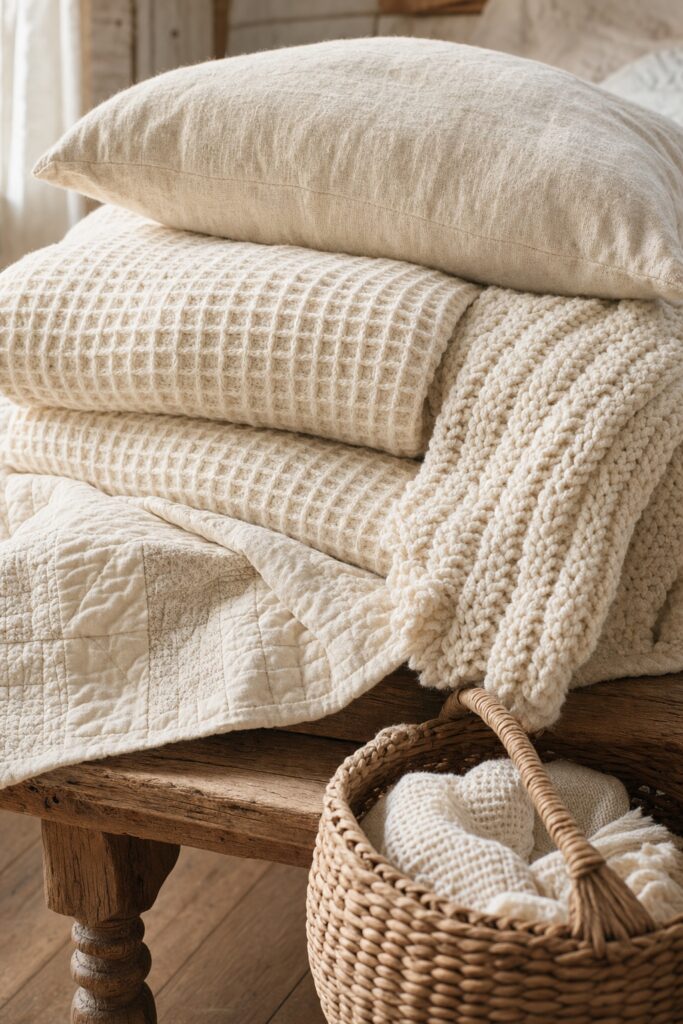
Cottagecore reads as cozy because almost nothing in it is smooth, shiny, or brand-new-looking. This is the layer people skip, and it is the one that separates a real cottage feel from a flat catalog room. Reach for materials that show their nature and age well: warm wood with visible grain, wicker and rattan, linen and cotton, wool, ceramic and stoneware, a little aged brass or iron.
The move is to mix textures within a single color so the room stays soft but never boring. A cream bed can hold a waffle-weave blanket, a chunky knit throw, a linen pillow, and a quilt — all pale, all different to the touch. Your eye reads that as depth; a room of one smooth fabric reads as unfinished.
Wood is worth being picky about. A well-worn oak table, a spindle chair, or a painted dresser with a little chipping does more for the look than a new piece pretending to be old. This is also why the aesthetic is friendly to a small budget: secondhand and thrifted wood, with its real patina, is usually both cheaper and more convincing than new.
Layer 3: Mix in vintage pieces and a little floral

A few genuinely old things and one or two floral patterns tip a natural room fully into cottagecore. Vintage is the heart of the look — a flea-market landscape painting, an ironstone pitcher, a stack of cloth-bound books, an embroidered linen. These carry a history that a matching furniture set cannot fake, and they are what make thrifting the natural way to shop this style.
Florals are the signature pattern, joined by gingham, ticking stripe, and simple checks. The trap is using too much of one print, or a print that is too big and modern, which flips the room from cozy to theme-park fast. A little goes a long way: one floral curtain, a ditsy-print pillow, a single papered wall.
Choose small-scale, slightly faded prints over large, punchy ones. A tight floral or a fine gingham reads antique; an oversized tropical bloom reads like a hotel. When in doubt, keep the pattern on the smaller pieces you can swap cheaply — pillows, a table runner, tea towels — and let the big furniture stay plain.
How to mix patterns without it looking busy
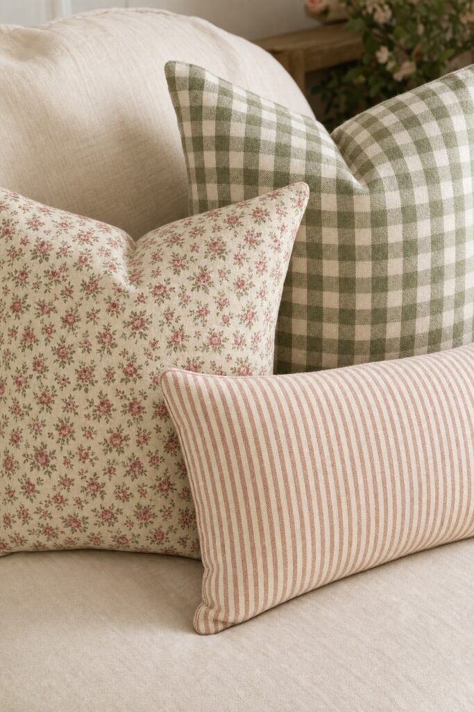
Two patterns will play together if they share one color and differ clearly in scale. That is the whole rule. A rose-and-cream floral pillow sits happily next to a sage gingham because the rose or the green ties them, and because one print is small and busy while the other is a simple even check. Two patterns at the same size and different colors fight; two that share a color and vary in scale harmonize.
Give the eye a rest between the patterns. Solid, textured pieces in your base color — a plain linen sofa, a cream curtain, a wood floor — are the quiet space that makes the florals feel special instead of overwhelming. If a corner feels chaotic, the fix is usually to remove one pattern, not to add a third to "balance" it.
Layer 4: Bring the garden inside

Nothing else says cottagecore as immediately as real, growing greenery. The aesthetic romanticizes cottage-and-garden life, so living plants, a jug of cut flowers, dried grasses, foraged branches, and a few herbs on the windowsill are essential rather than optional. They also add the one thing decor cannot: gentle movement and a little imperfection.
Keep the containers as humble as the plants. Terracotta pots, a chipped enamel jug, a mason jar, a wicker basket around a plastic grower's pot — the vessel should look found, not designed. A short, loose, slightly wild arrangement suits the look far better than a tight florist's bouquet.
You do not need a greenhouse. One larger plant on the floor, a trailing plant up high, and a small jar of whatever is blooming or branching outside will carry a whole room. Fresh beats fake here — plastic flowers are the fastest way to lose the "collected and real" feeling — but a few good dried stems are a fair, low-effort compromise in a dim corner.
Keep the plants pet-safe

Several of the plants and cut flowers this look leans on are toxic to cats and dogs, so check before you fill a shelf. True lilies are the serious one: even a little pollen from a Lilium or Hemerocallis lily can cause kidney failure or death in cats. Pothos, peace lily, sago palm, and tulips are also commonly toxic, per the ASPCA's toxic and non-toxic plant database.
If you have pets, you can still get the lush cottage-garden feel with plants the ASPCA lists as non-toxic — spider plant, Boston fern, calathea, parlor palm, and African violet are all safe, easy, and very on-theme. For cut flowers, roses, sunflowers, snapdragons, and stock give the loose garden look without the lily risk. When you are unsure about a plant, look it up on that ASPCA list before it comes home, and keep hanging or high-shelf greenery out of a curious cat's reach.
Layer 5: Light it soft and warm

One cold ceiling light will undo the other four layers, so light the room low, warm, and in several places. Cottagecore is a candlelit, golden-hour aesthetic. Swap or supplement the harsh overhead with table and floor lamps, a warm bulb or two, real or flameless candles, and — used sparingly — a string of small warm lights along a shelf or window.
Warmth here is literal: choose "soft white" or warm bulbs rather than the bluish "daylight" ones, so cream walls glow instead of turning gray. Three small pools of light at different heights — a table lamp, a floor lamp, a candle — make a room feel far cozier after dark than a single bright fixture ever will.
This layer is where the moody dark-cottagecore look really lands. Against deep green or brown walls, a couple of warm lamps and a lit candle read as a snug, storybook evening. Keep candles in proper holders and string lights clear of fabric, and lean on flameless candles anywhere they will sit unattended.
Add the handmade, personal touches last

The final layer is the one that makes the room yours instead of a copy: the handmade and the personal. Cottagecore quietly values making things over buying them, so a quilt, a cross-stitch sampler, pressed flowers in a frame, an embroidered tea towel, or a shelf of your own jam jars does more for authenticity than another store-bought accessory.
You do not have to craft it yourself. Handmade and one-of-a-kind pieces from a maker, a family hand-me-down, or a thrifted textile someone else stitched all carry the same made-by-hand warmth. The point is that the object has a story, even a small one, rather than a barcode.
Add this layer slowly and on purpose. A room that fills with meaningful pieces over months looks collected; a cart of "cottage-style" decor bought in one afternoon looks staged. Leaving room to add things later is part of the style, not a sign it is unfinished.
Cozy, not costume-y: how to keep it intentional

The line between charming and kitschy is curation: display things you genuinely love, grouped and given space, not random "cottage" props bought to fill a look. A collected room reads as a peek into a real person — your grandmother's teacups, the books you actually read, the mushrooms you keep picking up at markets. A costume-y room reads as a big-box store's idea of a cottage, with mass-made signs and fake florals covering every surface.
Three habits keep it on the right side of that line. Group like things into one vignette instead of scattering them — a cluster of ceramics on one shelf has more charm than single pieces on every surface. Keep negative space so the eye can rest; a clear stretch of wall or an empty tabletop corner makes the styled areas feel chosen. And edit as you go — if a surface is starting to feel like a shelf at a craft fair, take a third of it away.
The honest test: can you tell a short story about most objects in the room? If yes, it will feel intentional no matter how full it is. If most of it is "I bought this because it looked cottagecore," that is the part to thin out.
Cottagecore in a rental, without permanent changes

Almost every layer of this look is renter-friendly, because cottagecore is built from textiles, freestanding furniture, and plants rather than construction. The palette lives in your curtains, bedding, and rugs; the texture and vintage come in freestanding pieces you take with you; the plants and soft lamps need no permission at all. You can get most of the way there without a single hole.
For the built-in cottage feeling — a papered wall, a hung plate collection — reach for removable versions. Peel-and-stick floral wallpaper gives you the accent wall and comes off cleanly when it is applied to a smooth, clean, fully cured painted wall and pulled away slowly at a low angle. Heavy texture like knockdown or orange-peel reduces how well it sticks and can show through, so test a sample in a corner first; the same surface trade-offs apply to any stick-on material, as in our peel-and-stick backsplash guide.
To hang art, plates, or dried flowers without nails, use adhesive hooks and strips — but respect the weight. Each product has a stated maximum, and a heavy frame on an undersized strip will fall; 3M publishes Command product weight limits for exactly this. Check your lease before covering a wall, test any adhesive in an inconspicuous spot, and follow the product's removal steps, since "removable" describes the product under good conditions, not every wall.
Where to start, room by room

Start in the room where you already have the most texture and the least fighting to do — usually the bedroom — then repeat the formula elsewhere. A bed is a texture engine: layered linen, a quilt, and a couple of pillows in your palette get you 80% of the way in an afternoon. See the small bedroom guide for a layout that leaves room for a reading nook and a plant.
In the kitchen, cottagecore hides in the small stuff: open a shelf for ceramics and cookbooks, add a gingham or ticking-stripe tea towel, set out a wooden board and a jug of flowers, and warm up the light. Our small kitchen ideas show how to free that counter and shelf space first.
In the living room, lead with a soft palette and one comfortable, slightly slouchy sofa, then layer a quilt, a floral pillow, a vintage side table, and lamps at two heights. The small living room guide covers scaling the seating so the cozy layers have somewhere to land. Whatever the room, run the same five layers in the same order and it will read cottagecore.
FAQ
What colors are cottagecore?
Soft, naturally faded ones: cream and ivory, sage and olive green, dusty rose, terracotta, butter yellow, and muted sky blue. The aesthetic avoids high contrast and glossy, highly saturated colors. A good starting palette is one warm neutral base plus one or two muted accents pulled from a garden.
Is cottagecore decor expensive?
It does not have to be — it is one of the more budget-friendly looks because it prizes vintage, secondhand, and handmade pieces over new matching sets. Thrifted wood, flea-market ceramics, real thrifted textiles, and cuttings from a garden give you the patina and the collected feel that new decor tries to imitate.
How do I make cottagecore look cozy instead of cluttered?
Display things you actually love, group them into vignettes instead of spreading them over every surface, and leave some empty space so the styled areas can breathe. Edit as you go: if a shelf starts to feel like a craft fair, remove about a third. Curation, not quantity, is what makes a full room feel intentional.
What is the difference between cottagecore and farmhouse?
They overlap but lean different ways. Modern farmhouse tends toward crisp white, black accents, shiplap, and a cleaner, more contemporary edge. Cottagecore is softer, more faded, more floral and vintage, and more romantic — think collected garden cottage rather than renovated farmhouse. Cottagecore also carries more color and pattern.
Can I do cottagecore in a rental?
Yes — most of the look is textiles, freestanding furniture, plants, and warm lamps, none of which need permission. For a papered accent wall or a hung collection, use removable wallpaper on a smooth, fully cured wall and adhesive hooks within their weight limits, test first, and check your lease before covering a wall.
Pick one room and one layer to start this weekend — usually the palette in your textiles, or a jug of flowers and a warmer bulb. Build the rest in order over the next few weekends, and let the vintage and handmade pieces arrive slowly. The look is supposed to gather over time; that is exactly why it feels so lived-in when it does.


