
Boho Decor Has Five Rules, Not None

Every guide to boho decor tells you the same thing: there are no rules. That advice is why so many boho rooms end up looking like a jumble sale.
The style absolutely has rules — five of them — and they are strict. What boho does not have is a shopping list, which is a very different thing.
Learn the five constraints and you can put almost anything in a room and have it work. Skip them and no amount of macramé will save it.
Jump to a section
- Boho is not "no rules" — it is five tight constraints
- Where the style comes from, and why that still decides how it looks
- Constraint 1: a narrow, warm palette — not "anything goes"
- Constraint 2: every object should show a maker's hand
- Constraint 3: natural materials have to outnumber synthetic ones
- Constraint 4: plants are structure, not decoration
- Constraint 5: leave the negative space in
- The one-store test: is your boho a costume?
- Boho, coastal, Scandi and eclectic: what actually separates them
- Three boho directions worth choosing between
- What dates a boho room fastest
- FAQ
Boho is not "no rules" — it is five tight constraints
Here are the five, and the one-line test for each.
- A narrow, warm palette. Test: can you name your room's colors on one hand?
- A maker's hand. Test: is anything in the room irregular, old, or handmade?
- Natural outnumbers synthetic. Test: count the plastics.
- Plants are structure. Test: would the room look unfinished without them?
- Empty space stays empty. Test: is at least one wall still bare?

A room that passes all five reads as bohemian even if every object in it is unrelated. A room that fails two or three reads as clutter no matter how many rattan pieces you buy. That is the whole thing, and the rest of this article is what each constraint means in practice.
Where the style comes from, and why that still decides how it looks
Boho is built on accumulation over time, and that history is why "buy the boho set" cannot work. The word came out of 19th-century France. The standard account of the term records that bohemianism "emerged in France in the early 19th century out of perceived similarities between the urban Bohemians and the Romani people" — la bohème being a common French term for Romani people, who were thought to have reached France in the 15th century by way of Bohemia, the western part of what is now the Czech Republic. It described the unconventional lives of artists, writers, journalists, musicians, and actors in European cities.

Two things follow from that, and both are visual.
The look was never designed; it was assembled. People with more taste than money furnished rooms out of what they inherited, salvaged, were given, or brought home. Nothing matched because nothing was bought together. That is not a stylistic quirk — it is the mechanism that produces the look.
So a room where everything matches cannot read as boho, however warm the colors are. Coherence has to come from the constraints below, not from things being a set.
It is also worth naming the awkward part honestly, because most decor writing skips it: the term's origin is a mistaken European label applied to Romani people, and much of what gets sold as "boho" borrows freely from cultures that were not consulted. That is a reason to buy from actual makers where you can, to skip anything sold as a costume version of someone's living tradition, and to be genuinely interested in where a piece came from.
Constraint 1: a narrow, warm palette — not "anything goes"
Pick a warm base plus two accents, and stop. This is the constraint the "no rules" advice destroys most reliably, because the photos that inspire people look colorful, and they mistake saturated for varied.

Look at any boho room you have saved and count the actual colors. It is almost always: a warm neutral base (cream, oatmeal, sand, warm white), one earth tone doing most of the work (terracotta, rust, ochre, clay), and one accent that shows up a few times (olive, mustard, deep teal, dusty pink). Three families, maybe four. It reads as rich because the textures are varied, not because the colors are.
The practical rules:
- Base on the big things. Walls, sofa, rug ground — warm neutral. These are most of what your eye sees.
- Earth tone on the middle things. Cushions, throws, pots, a chair. This is where the room gets its temperature.
- Accent three times, no more. One cushion, one pot, one small piece of art. Three placements read as chosen; seven read as accidental.
- Warm, not cool. A cool grey-blue in a boho palette fights everything else. If you love blue, use a warm one — teal, indigo — and treat it as the accent, not the base.
If a color in your room does not fit that structure, it is not automatically wrong, but it should be doing an obvious job. One deliberate outlier is character. Four are noise.
Constraint 2: every object should show a maker's hand
Boho is the only major decorating style where visible imperfection is a requirement rather than a flaw. This is the constraint almost nobody names, and it is the strongest predictor of whether a room reads as genuine.

An object qualifies if it shows one of three things:
- Handwork — throwing rings on a pot, an uneven rim, a hand-knotted fringe, a slub in a handwoven fabric, a visible seam.
- Age — worn edges, faded dye, a patina, an honest repair.
- Natural irregularity — the grain and knots of real wood, the variation in undyed wool, the mottling of unglazed terracotta.
A room can have plenty of new, ordinary, mass-produced things in it — most rooms do, and yours should not be an antique shop. But the objects that carry the look need to fail the perfection test. Two flawless glazed vases and a machine-perfect woven basket will read as a display, not a home, no matter how good the palette is.
The cheapest way to satisfy this: thrift the small things. A wooden bowl, a stoneware jug, a brass tray and a picture frame from a charity shop cost less than one new decorative object and all four pass the test automatically. Hunt for the chip, don't avoid it.
Constraint 3: natural materials have to outnumber synthetic ones
Count them. The naturals should win clearly, not narrowly. Boho's warmth comes almost entirely from how materials handle light: matte, irregular natural surfaces absorb and scatter it, while flat synthetic surfaces bounce it back evenly and read as cold.
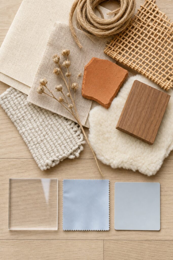
Materials that carry the style: cotton, linen, wool, jute, sisal, rattan, cane, seagrass, solid wood, unglazed terracotta, stoneware, leather, brass, sheepskin.
Materials that quietly undo it: high-shine acrylic, obvious polyester with a synthetic sheen, plastic laminate, chrome, glossy white plastic, and fake plants.
This is not purism, and you do not have to replace your things. Some synthetics are the right call — a performance-fabric sofa in a house with a dog is a good decision, and a polyester-blend rug that survives a toddler is better than a wool one you resent. The rule is about the ratio and the visible surfaces. Put the naturals where they show: the textiles you can see, the pots, the baskets, the tabletop objects, the frames.
The two synthetics worth eliminating outright are fake plants — they fail this constraint and constraint four at the same time — and anything high-gloss, because a hard shine in a matte room draws the eye straight to the one thing that does not belong.
Constraint 4: plants are structure, not decoration
In boho, plants do a furniture job. In most styles a plant is a finishing touch you could remove without the room collapsing. Here, plants fill vertical space, soften hard corners, and break up straight architectural lines — and a boho room without them looks unfinished in a way that is hard to name but easy to see.

That changes how you choose and place them:
- Buy for shape, not for species. You need three jobs covered: something tall and architectural for a corner (fiddle leaf fig, rubber plant, snake plant, a large palm), something trailing for height without floor space (pothos, philodendron, string of hearts), and something broad and low for a table or shelf.
- Go bigger than feels sensible. One large plant does more structural work than five small ones, and five small ones on five surfaces is how you lose your surfaces.
- Match the plant to the light in that exact spot, not to the room's brightest window. The University of Arkansas Cooperative Extension puts low-light plants at a minimum of 25 foot-candles (75–200 preferred), medium at 75–100 minimum (200–500 preferred), and high at 200 minimum (500–1,000 preferred). A free light meter app will sort your room in ten minutes.
- Three to five real plants is the useful range for an average room. Beyond that you are running a nursery, and dying plants read worse than no plants.
Real ones only. A fake plant is the single fastest way to make an otherwise good boho room feel like a showroom, because it fails the maker's-hand test, the natural-material test and the plants-as-structure test simultaneously. If a room genuinely has no light, use dried stems, branches, or pampas — dried is honest, plastic is not.
Constraint 5: leave the negative space in
At least one wall stays bare, and every surface keeps some clear space. This is the rule people break last and hardest, because it is the only one that asks you to stop.

Boho is additive by nature. You collect, so the collection grows, so the room fills — and there is no natural stopping point built into the style. You have to supply one.
What "enough empty space" actually looks like:
- One wall with nothing on it, or close to nothing. This is what makes the decorated walls read as decorated rather than as wallpaper.
- Objects in tight groups with real gaps between the groups, rather than spread evenly across a wall. Even spacing reads as a product display; clustering reads as collected.
- Every horizontal surface at least a third clear. A coffee table you cannot put a mug on has stopped being furniture.
- Floor you can see. Overlapping three rugs fills the one plane that was giving the room room to breathe.
If a room feels wrong and you cannot say why, the answer is nearly always this constraint. Take a third of the objects out and put them in a box for two weeks. Most of them do not come back.
The one-store test: is your boho a costume?
If a stranger could name the store your room came from, it is not boho yet. This is the most useful self-check in the article, and it follows directly from the history: a style defined by accumulation cannot be bought in one transaction.

The tell is not the objects; it is the uniformity. One shop's version of boho has a single palette, a single finish, and a single vintage. Buy eight pieces from it and they betray each other — same sheen, same tone, same year, arranged with the same spacing.
How to pass the test without starting over:
- Break up the set you already own. If six things arrived together, split them across different rooms and different heights so they never read as a group.
- Add three things from three different decades. One genuinely old object does more for authenticity than five new ones. Thrift stores, estate sales, and family cupboards are where this comes from.
- Introduce one object with a real story — something inherited, brought back from somewhere, made by someone you know, or made by you. It does not have to be valuable. It has to be specific.
- Stop buying "boho" as a search term. Search for the object instead: a stoneware jug, a wool flatweave, a cane chair. Anything sold under the style label is designed to match everything else sold under it, which is precisely the problem.
Boho, coastal, Scandi and eclectic: what actually separates them
These four get confused constantly, and the difference is materials and temperature, not vibe. Here is the stable version.
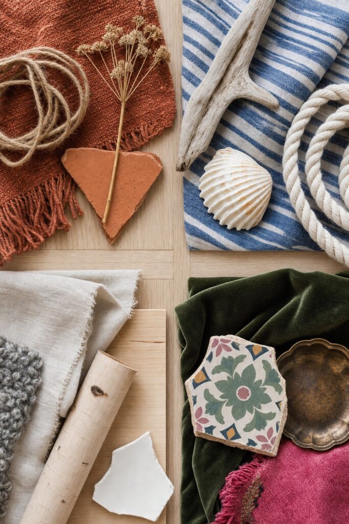
- Boho — warm temperature, high texture, high object count, narrow warm palette, visible age and handwork. Natural fibers in earth tones. The organizing logic is accumulation.
- Coastal — cool temperature, medium texture, light and bleached. Blues and whites, bleached wood, rope, linen. The organizing logic is light and air.
- Scandinavian — neutral-to-cool temperature, low object count, pale wood, undyed wool, clean lines, lots of white. The organizing logic is restraint.
- Eclectic — no temperature rule at all, which is the actual difference. Eclectic mixes periods, colors and styles freely. Boho mixes objects freely but holds the palette and the materials tight.
That last distinction is the one worth keeping: eclectic varies everything; boho varies everything except color and material. If your room mixes a cool grey sofa, a mid-century teak cabinet and a Persian rug and it works, that is eclectic, and it is a perfectly good thing to be. It just is not boho.
The styles do blend, and the blends have names people use — coastal boho (boho materials, coastal palette), Japandi (Scandinavian restraint with Japanese craft), modern boho (the constraints with a lower object count). If you like one of those better, our guides to Japandi and coastal decor go into each properly.
Three boho directions worth choosing between
Pick one direction rather than trying to do all of boho at once. The style covers a wide range, and rooms that try to cover all of it are the ones that end up muddy.

Desert boho — the warmest and currently the most common. Rust, terracotta, ochre, clay, cream; dried grasses; unglazed pottery; leather; lots of straw and jute. Suits rooms with warm light and yellow-toned wood. The risk is monotony: without a cool accent somewhere, everything blurs into beige.
Jungle boho — plant-led and much greener. Deep green, olive, dark walnut, brass, cream; big-leaved plants doing the structural work; darker woods. Suits rooms with good light and a bit of drama. The risk is upkeep, because the whole look depends on plants staying alive.
Modern boho — the pared-back version, and the easiest to live with long term. The full constraint set but a much lower object count: cream, oatmeal, one earth accent, bleached or pale wood, clean-lined furniture, a handful of genuinely good handmade pieces instead of many. Suits small spaces and anyone who likes the warmth but not the density. The risk is drifting into plain Scandinavian — the maker's-hand constraint is what keeps it boho.
You can move between them over time. What you cannot do is run all three in one room, because each one's palette cancels the others.
What dates a boho room fastest
Mass-produced versions of handmade things. When a boho object becomes a big-box product, it stops signalling "collected" and starts signalling the year it was on the shelf.

The specific things aging fastest right now, and what to do instead:
- Identical machine-made macramé. The handmade version is still good; the version that appears in every apartment is not. Keep one, and prefer one you can tell was knotted by a person.
- Dyed pampas grass. Real dried stems, branches, eucalyptus and wheat all age well. Pink and grey dyed pampas is dated already.
- Fake plants of any kind. See constraint three.
- Word art and "live laugh love"-style lettering. Boho's whole logic is objects, not slogans.
- The flawless matching set from a single homeware range. Fails the one-store test on sight.
- Wire-and-bead hoop hangings and anything else that arrived as a trend rather than as an object with a use.
What does not date: real wood, real ceramics, wool and cotton textiles, brass, cane and rattan furniture, plants, books, and anything genuinely old. Those have survived every iteration of this style for two hundred years and will survive this one. When in doubt, buy the thing that would still have made sense in the room fifty years ago.
FAQ
Is boho decor still in style?
Yes, though the version of it has shifted. The dense, heavily layered look of the late 2010s has given way to a more restrained "modern boho" — the same constraints with fewer objects. The underlying elements (natural materials, handmade pieces, warm earth palettes, plants) have been in and out of fashion for a century and are not going anywhere.
What is the difference between boho and bohemian?
Nothing meaningful in decorating terms — "boho" is simply the shortened form. In practice "bohemian" is used slightly more often for the maximal, layered, jewel-toned version, and "boho" for the warm, neutral, current one, but no one is policing this.
How do I do boho on a small budget?
Thrift the small objects and buy nothing labeled boho. The five constraints cost almost nothing to satisfy: a narrow palette is free, secondhand objects satisfy the maker's-hand rule for a few dollars each, natural materials are usually the cheaper option secondhand, plants can be propagated from cuttings, and empty space is free by definition.
Does boho work in a rental?
Well, because most of it is objects and textiles rather than fixed finishes. Nothing in the five constraints requires drilling or painting. The one thing to plan around is hanging the wall pieces, which our guide to decorating with adhesive hooks covers.
Can boho work in a modern apartment with white walls and grey floors?
Yes, and white walls are an advantage. Grey flooring is the harder part because it is cool and the palette is warm. Cover most of it with a large warm-toned flatweave rug and keep the wood tones in the room mid-to-warm; the floor then reads as a border rather than as the room's base color.
How many patterns can I mix?
As many as you like, as long as they share the palette and differ in scale and texture. That is the working rule: colors repeat, everything else varies. Two patterns at the same scale in the same colors will fight; three at different scales in one colorway will not. Our boho living room guide works through this in the room where it matters most.


