
Japandi Has Two Parents, and Both Have to Show Up in the Room

Japandi is two design traditions sharing one room: Japanese restraint and Scandinavian warmth. Most pages describe it — natural materials, muted colors, low furniture — and then show you a gallery. Descriptions are hard to shop with.
So this article turns it into a test instead. A room only counts as Japandi if both halves are visible in it, and a lot of what gets tagged Japandi online is Scandinavian design with a plant in front of it. Below: the test, the five moves that build the look, and twelve complete rooms you can copy.
Jump to a section
- What makes a room Japandi and not just Scandinavian
- The proportions come from a room about 100 square feet
- The five moves that build the look
- Japandi living rooms
- Japandi bedrooms
- Japandi kitchens and dining
- Japandi entryways and work corners
- Japandi in a rental: every anchor moves with you
- The four ways Japandi goes wrong
- What to buy first, and what to wait on
- FAQ
What makes a room Japandi and not just Scandinavian
The difference is contrast and emptiness.
Scandinavian rooms are built on light. Crisp whites, pale birch and ash, soft textiles on almost every surface, and a general instinct to make everything a little brighter. Japandi keeps that base and then does two things Scandinavian design largely doesn't: it puts a genuinely dark mass into the room, and it leaves parts of the room deliberately bare. Comparison guides published this year land in the same place — Scandinavian sticks to light woods and pale neutrals, while Japandi mixes those with walnut and black-stained oak and carries "a darker anchor against the warm neutrals."
That gives us a test we use for every room in this article. Count the moves in each column:
From Scandinavia
- a light base — pale walls, pale wood, daylight kept open
- warm textiles — wool, linen, sheepskin, something soft to sit on
- layered lamp light rather than one ceiling fixture
- at least one curve, so the room isn't all right angles
From Japan
- a dark anchor, big enough to see from the doorway
- low furniture and long horizontal lines
- space kept empty on purpose
- one handmade object that isn't perfectly finished
The verdict: left column only, and you have a Scandinavian room. Right column only, and you have minimalism that reads cold and unfinished. You need at least one from each side. That is our test, not a rule anyone else publishes — but it's the fastest way we've found to tell the two styles apart, and it works in both directions: it tells you what your room is missing as well as what it is.
Worth saying plainly, because a lot of writing about this style implies otherwise: Japandi is a modern Western word. It emerged around 2016 as a portmanteau of Japan and Scandi. The philosophies underneath it are old — Japanese wabi-sabi and Scandinavian hygge — but "Japandi" itself is a recent label for a blend, not an ancient tradition you can get wrong.

The proportions come from a room about 100 square feet
Here's the part that makes this style genuinely useful in a small home, and nobody seems to mention it.
Traditional Japanese rooms are measured in tatami mats. A mat is always a 2:1 rectangle, and room size is quoted in mats — the unit is jō — even in rooms that have no tatami in them. The standard room is six mats.
Do the arithmetic. In the Tokyo (Edoma) standard, one mat is 1,760 × 880 mm, which is about 35 by 69 inches. Six of them come to 9.29 m², or almost exactly 100 square feet. Kyoto-standard mats are larger, so a six-mat room there works out closer to 118 square feet. Either way, the proportions that define this look — low seating, long horizontal lines, one big empty patch of floor — were worked out for rooms the size of an average US small bedroom.
That's the opposite of the usual objection. Low-and-horizontal isn't a big-house look that shrinks badly. It's a small-room system that scaled up.

The five moves that build the look
Five decisions do most of the work, and they're worth making in this order: base first, anchor second, everything else after. Get the first two wrong and no amount of ceramics will fix the room.

A light base and one dark anchor
Paint or keep the walls in a warm off-white, oatmeal, or the palest greige, then put one dark, furniture-sized object in the room.
The anchor is the move people skip, and it's the whole difference. A black vase on a shelf does nothing — at three steps back it's a dot. To register, the dark mass has to be big enough to see from the doorway: a black-stained oak cabinet, a charcoal armchair, floor-length curtains in a deep brown, a dark rug, or one large frame. That's our opinion rather than a rule, and the reason is simply how contrast works at a distance. Small dark objects read as clutter. One large one reads as structure.
One anchor per room is usually enough. Two can work if they're on opposite sides and roughly the same tone. Three and you've drifted into a different style entirely.

Low furniture and long horizontal lines
Sit everything lower than you normally would, and line the tops up.
Current retail sizing gives a useful benchmark: standard sofas seat around 18 to 20 inches off the floor, while low-profile sofas come in at roughly 15 to 17. Those are shopping ranges, not standards, but they show the size of the shift — two or three inches, which is enough to change how tall the room looks without making the sofa hard to get out of.
The horizontal part matters as much as the height. A long low sideboard, a bench under a window, a run of shelf at the same height as the sofa back — each one draws a straight line across the room, and lines like that make a wall read wider. Save the vertical elements for one or two deliberate moments: a tall plant, a floor lamp, a narrow ladder shelf.

Ma: one clear rectangle of floor, one clear run of surface
Ma) is the Japanese term for space left deliberately empty — an interval that's doing something, not leftover room you haven't filled yet. It's the idea most often flattened into "declutter," which isn't the same thing at all. Decluttering is about removal. Ma is about keeping.
Since it's hard to check a philosophy, here's our version of it, borrowed from the tatami arithmetic above: keep one uninterrupted rectangle of visible floor roughly one mat in size — about 35 by 69 inches — and one clear run on the room's largest surface. Nothing crosses either. No basket parked at the edge, no charger, no stack of anything.
In a small bedroom that rectangle is usually the strip beside the bed. In a living room it's the floor between the sofa and whatever faces it. Once you've picked it, it becomes a decision you can enforce, which is more than "less is more" ever gives you.

One handmade object that isn't quite perfect
Wabi-sabi is the acceptance of imperfection, impermanence, and incompleteness, and in a room it shows up as one object that clearly came from a person's hands: a slightly lopsided thrown vase, a rough-glazed bowl, a wooden tray with visible tool marks, a hand-dyed cloth where the color isn't even.
One is the right number. This is the point where the style tips into a theme if you're not careful — a shelf of artisan ceramics stops reading as restraint and starts reading as a collection. And it should be something you use. A bowl that holds keys ages honestly; a bowl that holds nothing is a prop.
There's a practical reason to buy at least one genuinely well-made thing, too: minimal rooms are unforgiving. With nothing to distract the eye, uneven gaps, wobbly joints, and cheap finishes are the first thing you notice. Fewer, better objects isn't a moral position here — it's what the style physically requires.

Texture where pattern would normally go
Almost no Japandi room uses pattern. What keeps it from going flat is texture in several weights, held to one color family.
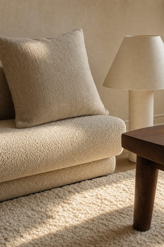
A working combination for a sofa area: a nubbly bouclé or wool seat, a loosely woven linen cushion, a flat paper or rush lampshade, and a rug with a visible pile. Four different surfaces, one narrow band of color. Stand back and you read texture, not stripes — which is why the room stays calm while still having something to look at.
If you want one pattern, make it a woven-in one at low contrast — a subtle herringbone or a slubbed weave — rather than a print.
Japandi living rooms
Four complete looks, sorted by which parent leads. Pick the one closest to what you already own — the Scandi-led rooms start from pale wood and textiles, the Japan-led ones from dark and bare.

Oak and cream, Scandi-led
The friendliest version, and the easiest to build from a room you already have. Cream walls, an oak coffee table, a light sofa, layers of wool and linen — then one charcoal armchair to carry the whole dark side of the test by itself.
Keep the wood tones close. Oak with oak, or oak with a slightly warmer ash, rather than four different woods arguing. If the room feels a little sweet, swap the cushion covers for undyed linen and take one thing off the coffee table.
Once you have the pieces, our small living room layouts cover where to actually put them.

Charcoal and plaster, Japan-led
The quieter, more serious version: limewash or matte plaster-look walls in a warm gray, a charcoal sofa, dark wood, and a lot of bare floor.
This one lives or dies on the Scandinavian half. Without it, the room reads like an empty office. Add one thick cream throw, one wool cushion, and two lamps at different heights — a floor lamp and a small table lamp — and the same room turns warm without losing any of its calm. That's the test doing its job.

The low sofa and the paper lamp
Built around a floor-level sofa, roughly 13 to 15 inches at the seat, with a large paper-shade floor lantern beside it.
The paper lamp is doing real work: it's a big, soft, low-glare light source, which is exactly what a low room wants at night. Choose one with an electric fitting and an LED bulb — the material is paper, and it belongs nowhere near a flame.
The trade-off is honest: low seating is harder to get out of, and it's a genuine drawback if anyone in the house has knee or hip trouble. In that case keep the sofa at standard height and get the low line from a long sideboard instead.

Walnut, black frames, and one big plant
The most graphic of the four. Walnut furniture, thin black metal frames on the art and the shelving, off-white walls, and one large plant — an olive, a rubber plant, a tall dracaena — as the only soft shape in the room.
Plants and daylight are core to this style rather than decoration on top of it, and a single big plant beats five small ones here. Five reads as a collection to maintain. One reads as a piece of furniture that happens to be alive.
Keep the frames genuinely thin. Chunky black frames turn the same room industrial.

Japandi bedrooms
The bedroom is where this style is easiest, because a bed is already a long low horizontal object. Three versions.

The low platform bed
The defining piece. Japandi-style platform beds commonly sit 12 to 16 inches from floor to mattress surface, against 24 or more for a standard frame with a boxspring — and floor beds go lower still, down around 4 to 8 inches. Those are current retail ranges rather than a standard, but the effect is consistent: dropping the mattress adds visible wall above the bed and makes the ceiling look higher.
Skip the headboard, or use a low slatted one. If the wall behind feels bare, that's ma, not a gap to fill — though one wide, low piece of art hung closer to the mattress than you'd think works well.
Two honest caveats. Low beds are harder to get out of, and the floor under them collects dust that a taller frame lets you ignore. A frame with a few inches of clearance rather than a solid platform makes cleaning far easier.

Three tones of one color, all in linen
Pick one color — clay, oatmeal, sage, stone gray — and buy the bedding in three tones of it. Palest on the sheets, mid on the duvet, deepest on the throw folded across the end.
It looks considered and it's nearly impossible to get wrong, because nothing has to match anything. Washed linen suits it best: it wrinkles, and the wrinkles are the point rather than a failure to iron. Add the dark anchor with the curtains or a dark bench at the foot of the bed.
More small-bedroom decisions, from layout outward, are in our small bedroom guide.

The nightstand with nothing on it
One lamp. That's the whole idea, and it's harder than it sounds.
A nightstand is the surface that quietly accumulates — glass, charger, book, hand cream, receipt. The version that works long-term has a drawer or a closed compartment, so the things you actually need at night have somewhere to be that isn't the top. Then the surface holds a lamp and, at most, one object.
This is the clear-run rule from earlier, applied to the smallest surface in the house. If it holds anywhere, it holds everywhere.

Japandi kitchens and dining
Kitchens are the hardest room for this style, because a kitchen has more objects per square foot than anywhere else and most of them are plastic. Three approaches that survive real cooking.

The counter you can see all of
One long run of counter with nothing standing on it, except possibly a board and a single ceramic crock.
The trick isn't discipline, it's relocation: the appliances you use daily go in a cupboard at chest height so getting them out costs three seconds, not a whole excavation. Pale cabinets, a wood or stone-look counter, matte black hardware, and that's the room. The dark hardware is doing the anchoring in a kitchen — there's usually no space for a dark piece of furniture.

One open shelf, edited down
Open shelving fits the style, but only if you accept the deal: everything on it is visible, so everything on it has to earn a spot.
One shelf, not four. Put the things you use daily and like looking at — a stack of plain bowls, two mugs, a wooden board leaned at the end — and nothing else. Everything with a printed label stays behind a door. Grease is the practical limit: a shelf directly above the hob needs wiping weekly, so put the shelf on a different wall if you can.

A round table and a bench
A round light-ash table with a dark bench along one side and two chairs on the other.
The round top is the curve the test asks for, and in a tight dining corner it also lets people past without a corner in the hip. The bench gives you the long horizontal line, and slides fully under when nobody's sitting on it — which in a small room means the floor stays readable. Keep the tabletop empty apart from one low bowl.

Japandi entryways and work corners
Two small spots where the style pays off immediately, because both are places where clutter is visible from the rest of the home.

The entry ledge that holds three things
A narrow shelf — 4 to 6 inches deep is enough — at about hip height, holding a tray for keys, one small hand-thrown dish, and nothing more.
Depth is the design decision here. A deep console becomes a dumping ground within a week; a shallow ledge physically can't. Hooks below at coat height, a dark mat or runner underneath as the anchor, and the whole thing costs less than a console table.

The desk that reads as furniture
A slim wood desk with visible legs, in the same wood as the rest of the room, so that when the laptop is shut the corner looks like a side table rather than an office.
Two rules do most of it: cables gathered into one sleeve and clipped under the top, and the monitor or laptop as the only tech object visible. A shallow drawer or a lidded box takes the rest. If the room is small, put the desk against the wall you don't see from the doorway — a work corner you can't see from the sofa is a work corner you stop thinking about after hours.

Japandi in a rental: every anchor moves with you
Nothing in this style needs paint or holes, which is unusual for a look built on contrast.
The dark anchor is the only element that sounds like it needs a wall, and it doesn't. All of these deliver it and leave with you:
- floor-length curtains in charcoal or deep brown on a tension or ceiling-clip rod — the biggest dark mass available, and it covers a bad window frame at the same time
- a dark low sideboard or cabinet — anchor and storage in one object
- a dark rug — anchors the floor, and also hides the beige carpet most rentals come with
- one large frame leaned against the wall on the floor rather than hung, which suits the low horizontal look anyway
- a charcoal armchair, if the room already has a light sofa you can't replace
The pale base is usually already there, since rental walls are almost always off-white. That means the style's starting condition is the one you were handed. More damage-free approaches are in our rental decorating hacks.

The four ways Japandi goes wrong
Four failures, in the order we see them most.
It's all beige. The single most common one: a pale, soft, pleasant room with no dark mass anywhere. It isn't a bad room — it's a Scandinavian room, and it will keep feeling slightly unresolved until something dark goes into it. This is the left column of the test with nothing from the right.
It's cold and looks unfinished. The opposite failure: dark, bare, and hard, with no textile softening anything. Two lamps at different heights and one thick wool throw usually fix it in an afternoon. Right column with nothing from the left.
It was bought as a set. Matching wood, matching finish, everything arriving in the same delivery. The style is built on a blend of two traditions and one object that a person made by hand — a room where everything matches loses the second half entirely. Break it with one older piece, one different material, or one thing that's visibly handmade.
It went theme. Buddha figures, bamboo props, sand trays, lettering you can't read on the wall. Japandi is a set of proportions — low, horizontal, contrasted, partly empty — not a shopping list of Japan-themed objects. And decorating with religious statuary is a genuinely uncomfortable look once you notice what you've done. If you want the reference, get it from the shapes: a paper shade, a slatted screen, an unfinished wood edge.

What to buy first, and what to wait on
If you're starting from an ordinary pale room, the order that gets you the most visible change per dollar:
- The dark anchor. One large object — curtains, rug, cabinet, or armchair. This is the purchase that makes the room stop looking Scandinavian.
- Lower the biggest thing. A low sideboard, a low bed frame, or a low coffee table. It costs the most, so it can wait for a sale, but it's what makes the room read as this style rather than a pale room with a dark thing in it.
- Textiles in one color family. Cheap, fast, and reversible. Three tones, one color, washed linen or wool.
- Two lamps at different heights. Nearly always an upgrade over the ceiling light alone.
- One handmade object. Buy it slowly, from someone whose work you like. It's the piece with no substitute.
What to wait on: a shelf of ceramics, extra plants beyond the first big one, and anything sold as a Japandi "set." The style rewards subtraction, so buying in bulk works against you.
For a completely different mood built the same careful way, our cottagecore guide takes the opposite approach — more pattern, more layers, same insistence on doing it deliberately.

FAQ
Is Japandi the same as minimalism?
No. Minimalism is about reducing the number of objects; Japandi is about a specific blend — a light Scandinavian base plus Japanese contrast and deliberately kept empty space. A Japandi room can hold plenty of things, as long as the dark anchor is present and some space is left clear on purpose.
What colors are Japandi?
A warm neutral base — off-white, oatmeal, greige, soft clay — with one deep tone for contrast, usually charcoal, black-brown, or black-stained oak. Muted sage, stone gray, and terracotta work as secondary colors. The distinguishing feature isn't the neutrals, which Scandinavian design also uses; it's the dark tone sitting against them.
Can Japandi feel warm rather than cold?
Yes, and the warmth comes entirely from the Scandinavian half. Wool and linen textiles, lamp light at two or three different heights instead of one ceiling fixture, and wood with a visible grain. A Japandi room that feels cold is almost always missing textiles, not missing color.
Does Japandi work in a small room?
Particularly well. The proportions come from traditional Japanese rooms measured in tatami mats, where the standard six-mat room is about 100 square feet in the Tokyo standard — roughly a US small bedroom. Low furniture and long horizontal lines were developed at that scale.
What furniture do I actually need?
Less than a style guide implies. One low seating piece, one low horizontal storage piece, one dark anchor (which can be one of the first two), and lighting at two heights. Everything after that is refinement.
Is Japandi still in style?
The word is recent — it appeared around 2016 — but what it describes is a blend of two long-established traditions, which is why it hasn't dated the way trend styles do. Its components are neutral walls, natural wood, and restrained furniture, none of which go out quickly.


